
8 Aesthetic Color Trends for Any Commercial Properties
Colors can bring life and flair to any property, especially commercial ones. And in this day and age, aesthetic appeal is everything. Whether running a shop, renting out an office, or managing a commercial building, keeping up with color trends can make a big difference in making your property stand out.
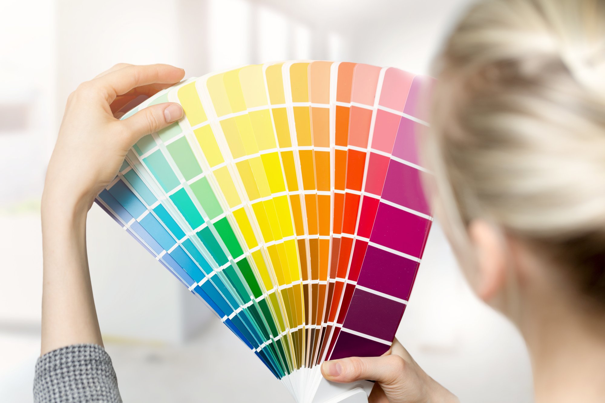
If you’re looking for inspiration on how to add some color to your space, look no further. Here are 8 aesthetic color trends you can apply to any commercial property.
Read on to learn more.
Contents
1. Warm Neutrals
Neutrals have always been famous for commercial spaces. They provide a sense of calm, but warm neutrals like beige and taupe give off a cozy feeling that makes people feel more at home. It creates a welcoming atmosphere perfect for shops, restaurants, and hotels.
Warm neutrals such as beige, taupe, or soft white emanate an inviting feel, making any commercial space appear more approachable. This versatility facilitates their application across various architectural styles and diverse business concepts.
Warm neutrals are also a harmonious base for bolder accent colors. It allows businesses to incorporate their branding shades without overwhelming the space.
The inherent warmth of these colors can contribute to a relaxed ambiance. It encourages customers to feel comfortable and stay longer. This makes them an excellent choice for commercial spaces striving to balance professional and cozy.
2. Shades of Blue
Blue is a timeless color that evokes feelings of calmness and relaxation. It works well with offices and medical spaces as it soothes the mind. It can also be used for retail shops, providing a refreshing backdrop for product displays.
Shades of blue, with their profound depth and versatility, can create myriad atmospheres in commercial spaces. Lighter shades, such as sky blue or baby blue, can instill a sense of tranquility and spaciousness, ideal for wellness centers or spas, where a serene environment is paramount.
For retail spaces, a bold sapphire or electric blue can add a touch of vibrancy and energy, capturing customers’ attention and showcasing products effectively. Furthermore, pairing blue with warmer colors or neutrals can balance calming aspects and bring a space to life. As such, the application of blue is refreshing and incredibly flexible, catering to diverse commercial interiors.
3. Muted Green
Green is known to bring a sense of calmness and nature and muted green shades have become popular lately. This color is perfect for spas and wellness centers as it mimics a soothing natural setting.
Muted green, a subtle variation of the vibrant hue can create a peaceful environment reminiscent of lush forests and tranquil meadows. A muted green shade is not as harsh as its brighter counterparts.
This allows it to blend seamlessly into various decors and color schemes. It introduces elements of nature and relaxation into the commercial space. It effectively reduces stress and improves overall mood.
4. Industrial Gray
Gray is a versatile color that creates an industrial vibe for your commercial space. It’s commonly used in tech offices and creative studios as it exudes minimalism and modernity.
The versatility of industrial gray lies in its ability to pair well with a wide range of color palettes. Whether complemented with vibrant pops of color or kept monochrome with other shades of gray, this color can shape diverse atmospheres, from dynamic and edgy to calm and sophisticated.
5. Saturated Red
While red has always been considered bold, it can be pretty sophisticated when applied in small doses. Saturated reds can be used in place of neutral shades to bring some life to your commercial space. It’s great for restaurants and cafes, as it stimulates the appetite.
Its psychological impact is also significant and stimulates the senses, including appetite, making it an ideal color for dining establishments and food-related businesses. Despite its intensity, saturated red can bring a sophisticated charm to your commercial property without overwhelming the senses when used mindfully and sparingly.
The power of saturated red extends beyond its visual appeal and carries significant psychological connotations. This vibrant hue has been associated with passion, excitement, and urgency-emotions that can be harnessed to create a lively and energetic ambiance.
6. Warm Mustard
Mustard has become a trendy color lately, and it blends well with natural wood elements, creating a warm and cozy feel. This shade is a great option for shops and boutiques, as it exudes a playful and lively atmosphere.
This color works particularly well in commercial spaces, inviting warmth without being overly bright or overpowering. With its earthy undertones, warm mustard pairs beautifully with rich textures like wood, leather, or metal, adding a touch of rustic charm to modern aesthetics.
In interior design, warm mustard can illuminate a room, replicating the effects of natural sunlight. This can help enhance the space’s perceived size and create a more open feel, making it an excellent choice for smaller or more confined commercial areas.
7. Pale Pink
Pink has been a color that businesses have shied away from, but it has become a popular choice lately, especially pale pinks that provide a calming touch. It can work well in various commercial prophesies, from hotels to fashion boutiques.
Pale pink, emerging as a modern neutral, adds a gentle touch of warmth and femininity to commercial spaces. It’s a color that resonates well with the current trend towards softer, more muted interiors, often seen in chic boutiques, contemporary cafes, and even innovative start-ups.
8. Earthy Terracotta
This warm color creates a homey feel that is perfect for small cafes and bakeries. If you want to connect strongly with nature, earthy terracotta also pairs well with greens and other earth tones.
With its rich and natural tones, Earthy Terracotta exudes a rustic yet refined charm, making it a popular choice for commercial spaces looking to incorporate coziness. Its robust character can infuse an organic, grounded feel into any space, promoting relaxation and comfort.
Beyond the color trends, it’s essential to consider professionalism. This is to ensure the job is done correctly. High-quality commercial painting services can transform a property, using expert techniques and equipment to seamlessly apply these aesthetic color trends.
Choose the Best Aesthetic Color Trends of Your Needs
Incorporating aesthetic color can make a big difference in your commercial property. It can make your space look fresh, modern, and welcoming. Whether you’re looking for a cozy feel or an industrial vibe, there’s a color and shade that can fit your needs.
Don’t be afraid to experiment and have fun with colors; it can ultimately provide you with a better ROI and strong customer loyalty.
For more helpful tips, check out the rest of our site today!